
How to Improve Your Website Conversion Rate — Without Simply Driving More Traffic
When a website isn't generating enough enquiries or sales, the instinctive response is often:
We need more traffic.
Sometimes that's true.
But increasing traffic to a website that isn't converting effectively can simply mean sending more people into a journey that isn't working particularly well.
Before investing more in SEO, paid advertising, social media or other traffic-generating activity, there is a more fundamental question to ask:
Are we making the most of the visitors we already have?
Improving website performance isn't only about attracting more people.
It's also about helping more of the right people understand what you offer, recognise its relevance, trust your business and take the next appropriate step.
That is where conversion optimisation begins.
What Does Website Conversion Actually Mean?
A conversion is simply a visitor taking an action that matters to the business.
For an ecommerce website, that might be completing a purchase.
For another business, it could be:
submitting an enquiry
booking a consultation
requesting a quotation
arranging a demonstration
downloading a resource
registering for an event
joining an email list
starting a trial
Not every website therefore has the same conversion objective.
And not every visitor should necessarily be pushed towards the same action.
Someone discovering your business for the first time may not be ready to request a quotation. They might need to understand the problem, compare possible solutions or establish whether your business is credible first.
Effective conversion optimisation starts by understanding what visitors need to do next, rather than simply adding more buttons to a website.
Start With the Right Visitors
Conversion rate can be misleading if you look at it in isolation.
Imagine two websites.
One attracts 10,000 visitors and generates 100 enquiries.
The other attracts 2,000 visitors and generates 80 enquiries.
The first website receives five times as much traffic, but the second converts a much higher proportion of its visitors.
That doesn't automatically mean the second website is better.
The quality of those enquiries, the source of the traffic, the value of the customers and the commercial results still matter.
This is why website performance shouldn't be reduced to a single percentage.
You need to understand:
Who is visiting?
Why are they visiting?
Where did they come from?
What are they trying to achieve?
What action do you want them to take?
What happens after they convert?
The objective isn't simply more conversions.
It's more of the right conversions from the right visitors.
Make It Immediately Clear What You Do
When somebody arrives on your website, they shouldn't have to work hard to understand your business.
Yet many homepages begin with broad statements such as:
Delivering excellence.
Solutions for a changing world.
Helping you achieve more.
They may sound positive, but they tell the visitor very little.
A strong opening section should quickly help somebody understand:
what you provide
who it is for
what problem or objective it addresses
why they should continue reading
what they can do next
This doesn't mean trying to explain the entire business in one headline.
It means giving visitors enough orientation to know:
I'm in the right place.
Clarity usually contributes more to conversion than cleverness.
Look at Your Website Through the Customer's Eyes
Businesses naturally build websites around themselves.
They organise navigation around internal departments.
They describe products using internal terminology.
They explain their history, processes and capabilities.
But visitors arrive with their own questions.
They may be thinking:
Can this company solve my problem?
Do they understand businesses like mine?
What exactly am I buying?
How is this different from the alternatives?
Can I trust them?
How much does it cost?
What happens if I contact them?
A website converts more effectively when it answers the questions customers need answered rather than simply presenting the information the business wants to communicate.
That requires a shift from:
What do we want to tell people?
to:
What does the customer need to understand before they can move forward?
Give Every Important Page a Job
One common website problem is that pages exist without a clear purpose.
A service page describes a service.
A product page lists features.
An About page tells the company story.
A blog provides information.
But what is each page supposed to help the visitor do?
Every important page should have a role within the customer journey.
For example, a service page might need to:
confirm that the visitor has found the right solution
demonstrate understanding of their problem
explain how the service helps
provide evidence and reassurance
answer likely objections
lead to an appropriate next step
Once you define the job of a page, it becomes much easier to decide what belongs on it — and what doesn't.
Strengthen the Path to Conversion
Visitors rarely convert because of one isolated element.
They move through a sequence of small decisions.
A typical journey might look something like:
Arrive → Understand → Recognise relevance → Build confidence → Evaluate → Act
If any part of that sequence breaks down, conversion becomes less likely.
A visitor might understand what you offer but not see why it is relevant to them.
They may recognise the relevance but not trust the claims.
They may trust the business but not understand what happens when they click the call to action.
They may be ready to act but encounter a complicated form.
That's why conversion optimisation should examine the whole journey, not just the final button.
Reduce Unnecessary Friction
Friction is anything that makes it harder for somebody to continue.
Some friction is unavoidable. A complex B2B purchase may genuinely require detailed information or several conversations.
But websites often introduce friction unnecessarily.
Examples include:
confusing navigation
slow-loading pages
unclear calls to action
excessive form fields
poor mobile layouts
difficult checkout processes
unexplained terminology
important information hidden too deeply
distracting pop-ups
inconsistent page layouts
broken links
unclear pricing or purchasing information
Individually, these issues can appear relatively minor.
Together, they can create a website that feels difficult to use.
The visitor doesn't necessarily think:
This website has excessive conversion friction.
They simply leave.
Make Calls to Action Specific
“Learn More” has its place.
But it is often used because the business hasn't decided what it actually wants the visitor to do.
A good call to action makes the next step clear.
Depending on the context, that might be:
Book a Demo
Request a Quote
Download the Guide
Explore the Learning Kit
View the Book
Start Your Assessment
Contact the Team
The wording should reflect what will actually happen.
And the call to action should be appropriate to the visitor's stage in the buying journey.
A person reading an introductory educational article may not be ready to “Buy Now”.
Giving them a useful next article, framework or resource might be a much more effective conversion step.
Conversion isn't always about forcing the sale earlier.
Sometimes it's about making it easier for somebody to continue the journey.
Build Trust Before Asking for Action
Visitors are more likely to act when uncertainty has been reduced.
That makes trust an important part of conversion.
Depending on the business, useful trust signals might include:
customer testimonials
case studies
recognised clients
reviews
accreditations
guarantees
professional qualifications
clear contact information
delivery and returns information
secure payment information
demonstrations of expertise
transparent explanations of what happens next
But trust shouldn't become a collection of badges added indiscriminately to a page.
The question is:
What might make this customer hesitate — and what evidence would genuinely reassure them?
For a technical buyer, detailed specifications may build confidence.
For a business owner buying professional advice, evidence of expertise may matter more.
For an online shopper, delivery, returns and payment security may be critical.
Effective reassurance is specific to the decision being made.
Don't Ignore Mobile Experience
A website can look excellent on a large desktop monitor and perform poorly on a phone.
Text may become difficult to scan.
Buttons may be awkward to use.
Images may dominate the screen.
Forms may become frustrating.
Important content may move too far down the page.
Navigation may become harder to understand.
That matters because the visitor experiences their version of the website, not the version you designed on your own screen.
Website reviews should therefore include the actual customer experience across different screen sizes rather than assuming a responsive template has solved the problem automatically.
Use Data to Find Where People Are Struggling
Conversion optimisation shouldn't depend entirely on opinion.
Website analytics can help identify where to investigate.
Useful questions include:
Which pages attract the most visitors?
Which pages contribute to conversions?
Where do visitors leave?
Which traffic sources generate valuable actions?
Are mobile visitors behaving differently from desktop visitors?
Which calls to action are being used?
Where do visitors abandon forms or checkout processes?
Behavioural tools can provide additional insight into how visitors interact with pages.
But data needs interpretation.
A high exit rate isn't automatically a problem. Someone may have found exactly what they needed.
A page with lots of engagement isn't necessarily commercially effective.
Analytics should help you identify questions to investigate, rather than automatically dictate changes.
Talk to Customers as Well as Looking at Analytics
Analytics can tell you what happened.
They don't always tell you why.
Customer conversations, enquiry feedback, sales teams, support questions and user testing can reveal problems that numbers alone may not explain.
Customers might tell you:
“I couldn't work out which option I needed.”
“I wasn't sure whether you worked with businesses our size.”
“I wanted to know the price before contacting you.”
“I didn't understand what happened after submitting the form.”
“I couldn't find the technical information.”
Those observations can be extremely valuable.
Website optimisation works best when quantitative evidence and human feedback are used together.
Improve the Proposition, Not Just the Page
Sometimes a website isn't converting because of its design.
Sometimes the problem is more fundamental.
The proposition may be unclear.
The offer may not be compelling.
The customer may not see sufficient difference between you and competitors.
The price may not appear justified.
The wrong audience may be arriving.
No amount of button testing can completely compensate for a weak proposition.
That's why website conversion should be considered within the wider marketing system.
Your website communicates decisions made elsewhere about:
customers, positioning, proposition, products, pricing, messaging and customer experience.
If those decisions aren't clear, the website often exposes the problem.
Test Meaningful Changes
Conversion optimisation is sometimes associated with changing button colours, moving headlines or testing tiny variations in wording.
Small changes can matter.
But begin with the issues most likely to have a meaningful impact.
For example:
Can visitors understand the proposition?
Does the page address their important questions?
Is there a clear next step?
Is sufficient evidence provided?
Is the form unnecessarily complicated?
Does the page work properly on mobile?
Is there an obvious obstacle in the purchasing journey?
Fixing a major clarity problem is likely to matter more than experimenting with five shades of a button.
Prioritise improvements according to their likely effect on the customer journey and business outcome.
AI Can Help You Review a Website — But It Doesn't Know Everything
AI can be extremely useful during website reviews.
It can help:
analyse page copy
identify unclear messaging
compare propositions
suggest customer questions
review information hierarchy
identify possible objections
analyse feedback
generate test hypotheses
compare pages for consistency
It can also help teams review larger websites much faster than would previously have been practical.
But AI doesn't automatically know whether a page is commercially effective.
It may not know why customers buy from you, which enquiries become profitable customers, what objections regularly arise in sales conversations or which business priorities matter most.
And an AI recommendation isn't evidence that a change will improve conversion.
Use AI to help identify, analyse and explore potential improvements.
Use customer knowledge, analytics, testing and commercial judgement to decide what to change.
Don't Optimise Conversion Rate at the Expense of the Business
This is an important distinction.
Imagine simplifying an enquiry form increases submissions by 40%.
That sounds successful.
But what if most of the additional enquiries are poorly qualified and create more work for the sales team without generating additional revenue?
The conversion rate improved.
The business outcome didn't.
The same principle applies to discounts, aggressive pop-ups, misleading urgency and other techniques that may increase immediate actions while damaging margin, trust or customer quality.
The objective isn't to maximise a website metric.
It's to improve the website's contribution to the business.
A Practical Website Conversion Review
A useful review can be structured around six questions:
1. Are we attracting the right visitors?
Look at traffic sources, search intent, campaigns and audience relevance.
2. Do visitors quickly understand what we offer?
Review headlines, proposition, terminology and page structure.
3. Can they see why it matters to them?
Check whether the website connects products and services to customer problems, objectives and outcomes.
4. Do we give them enough reason to trust us?
Review evidence, reassurance, expertise and answers to likely objections.
5. Is the next step obvious and easy?
Examine calls to action, forms, checkout processes, navigation and mobile usability.
6. Are we measuring what happens?
Connect website activity with enquiries, sales, customer quality and commercial outcomes.
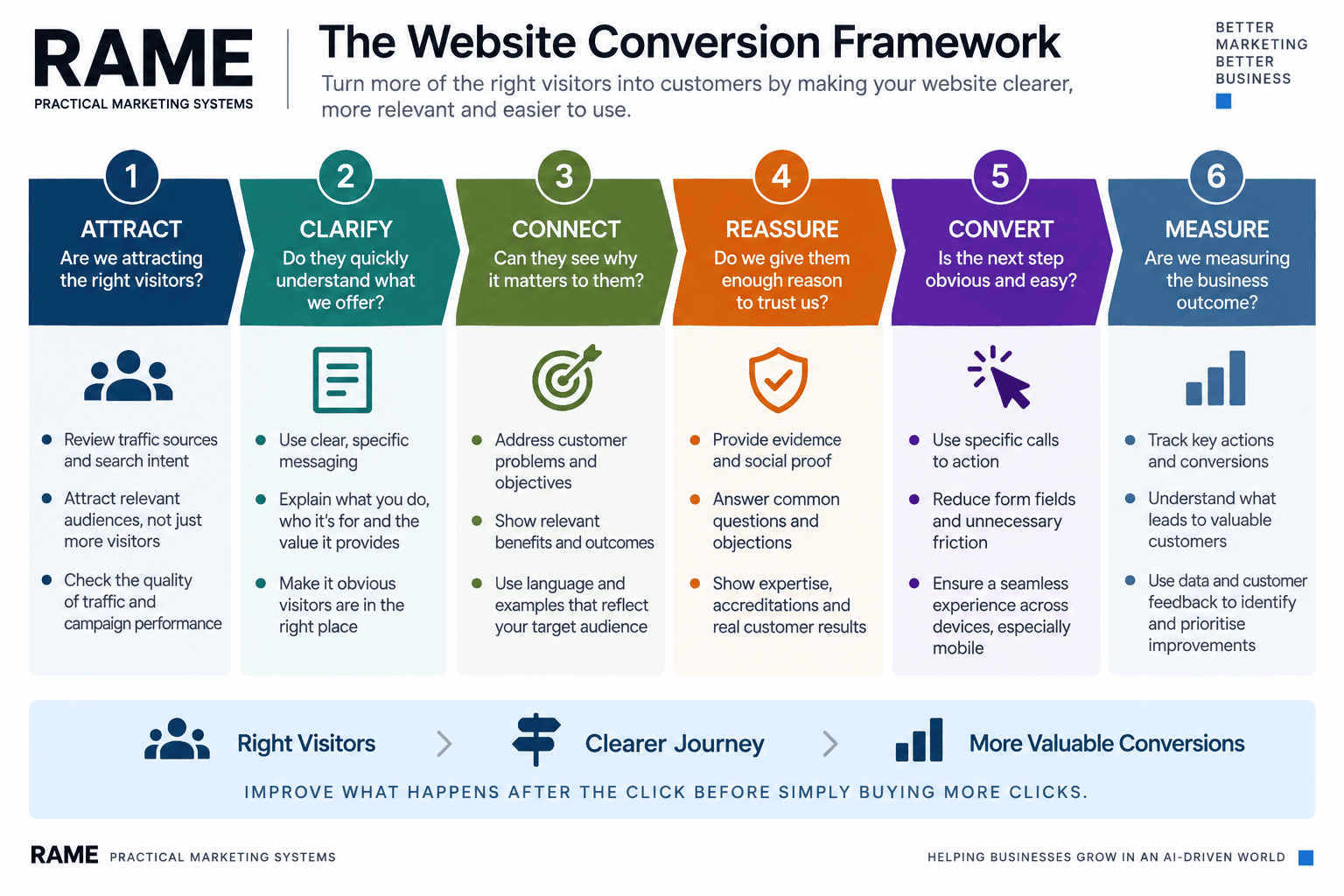
These six questions create a much more useful starting point than simply asking:
How can we get more traffic?
Improve What Happens After the Click
Traffic still matters.
A business needs people to discover its website.
SEO, advertising, social media, email, referrals and other channels can all play important roles.
But acquisition and conversion shouldn't be treated as separate worlds.
The value of traffic depends partly on what happens when that traffic arrives.
Before automatically spending more to attract additional visitors, understand the performance of the journey you already have.
Remove unnecessary friction.
Improve clarity.
Strengthen relevance.
Provide evidence.
Make the next step obvious.
Measure the commercial outcome.
Then, when you do increase traffic, you aren't simply putting more people into the top of the funnel.
You're sending them into a website that is better equipped to turn the right visitors into customers.
Continue Your Learning
Next Article
How to Improve Your Website User Experience
Related Framework
Website & Search Performance Review
Related Learning Kit
Module 2 — The Marketing Review